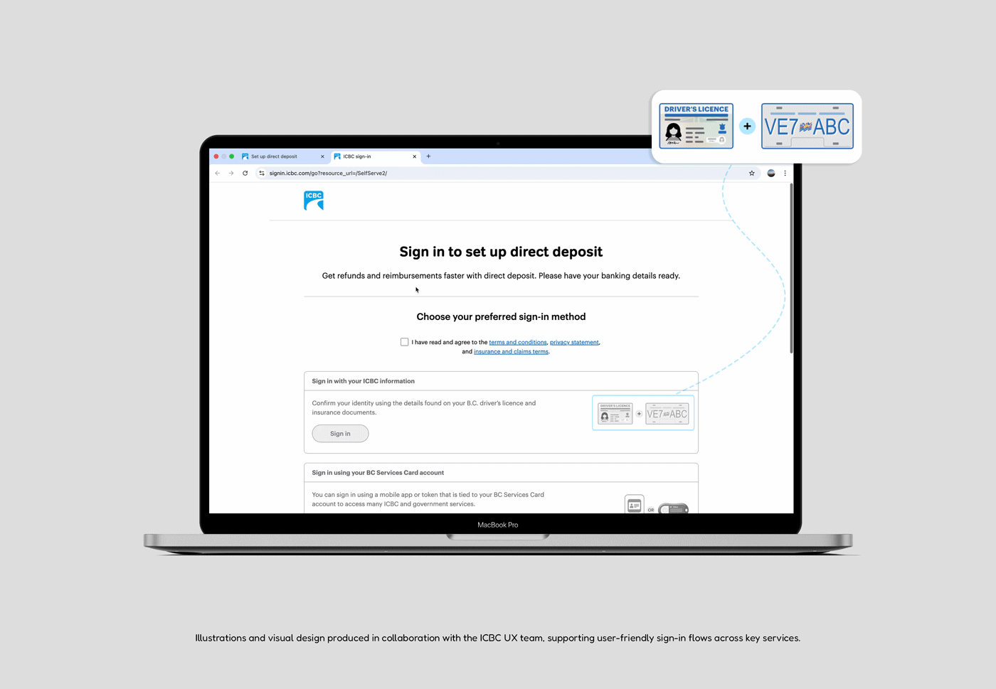
ICBC needed an intuitive sign‑in flow for digital services like “Manage Your Claims” and “Set Up Direct Deposit.” I designed a unified system of brand‑aligned illustrations that make each ID and document instantly recognisable.
Interactive states guide users by transitioning icons from grey to full colour when required actions are completed, and responsive layouts ensure the experience is clear and trustworthy on both desktop and mobile.
As the project’s sole designer and illustrator, I created the entire illustration system, establishing colour, typography and layout guidelines to match ICBC’s brand
I prototyped interactive states, collaborated with the UX team to integrate them into responsive sign‑in flows, and ensured consistency and accessibility across devices. This work improved users’ ability to select the right ID, reduced sign‑in errors and strengthened trust in the platform
ICBC provides services such as insurance, claims and direct deposit that require secure authentication. Users were often unsure which piece of identification they needed for sign‑in.
Design a cohesive illustration system aligned with ICBC’s branding to help users quickly recognize the correct ID or document and confidently start the sign‑in process
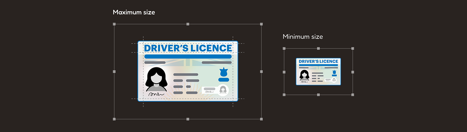
The main challenge was balancing realism so identity cards felt authentic with simplicity so they stayed clear and consistent across digital screens. Each element was simplified just enough to remain recognisable without clutter.
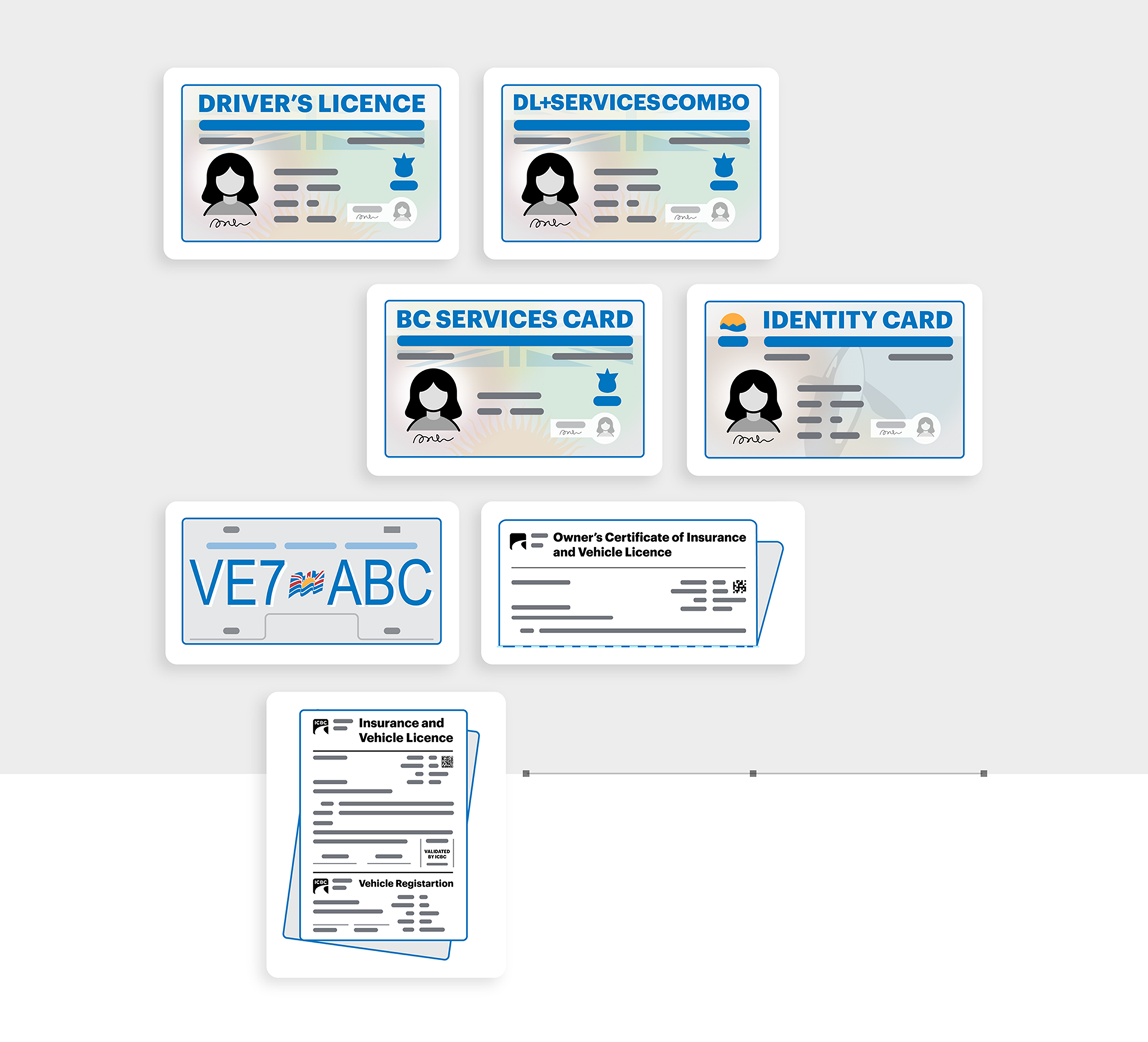
To remain true to ICBC’s brand, I followed a strict set of guidelines:
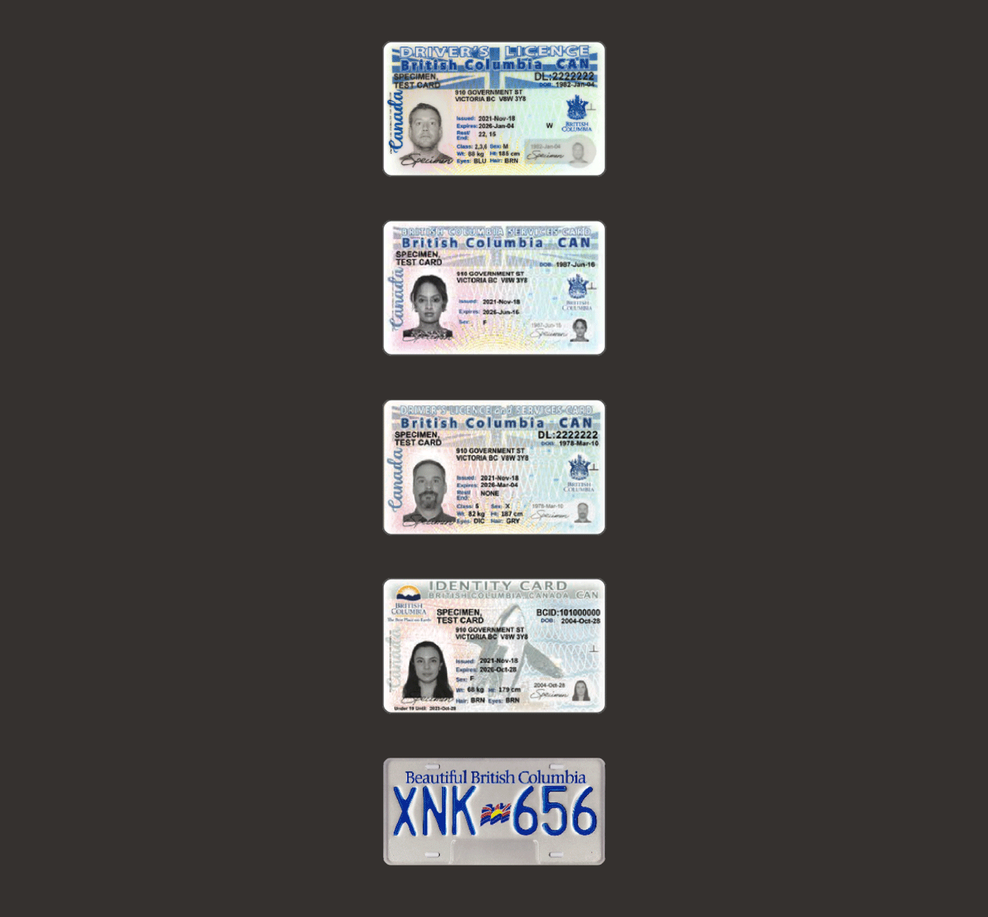
I created a complete family of ICBC‑branded IDs and documents. Each illustration has the same scale, level of detail and visual rhythm, so they feel cohesive when presented together. The system includes driver’s licences, BC Services Cards, combo cards, identity cards, licence plates, insurance certificates and other documents. A consistent visual set means every ID is recognisable yet still lightweight enough for responsive digital interfaces.
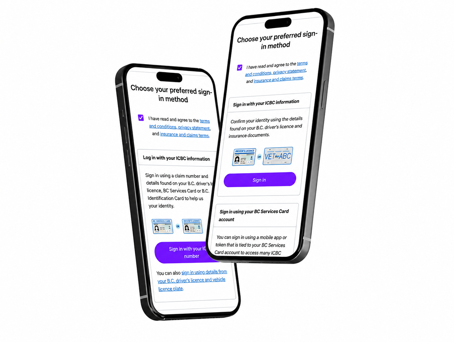
On ICBC’s online claims platform, the illustration system guides users through the authentication steps. When the sign‑in page loads, the IDs appear greyed out to indicate that a declaration must be accepted. Once the user selects the declaration box, the illustrations become fully coloured and the sign‑in options are activated.
This simple interaction pattern:
The same pattern is used in other flows such as Manage your claim and Set up direct deposit, so users know exactly which IDs they need and when.
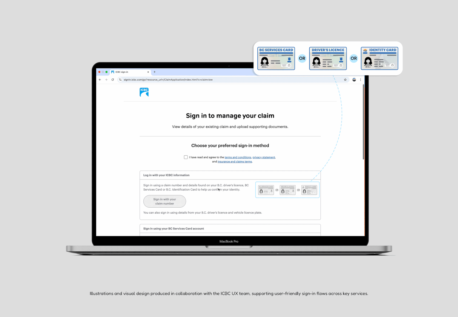
All sign‑in pages were built with a responsive layout, ensuring a seamless experience on both desktop and mobile devices. Mobile versions of the sign‑in pages maintain the same visual hierarchy and illustrations while adapting to smaller screens.

Designing for authentication taught me the importance of balancing brand guidelines with user clarity. I learned how small visual details—such as colour choices, layout rhythm and iconography—can have a big impact on trust and user confidence. It also reinforced that clear, accessible illustrations are as critical as strong UX copy when guiding people through secure workflows.